
Sunday, 27 April 2014

spring sensations tickets
|
SPRING SENSATIONS CONCERT
DOORS OPEN AT 6:30 PM AND CONCERT 7:00 PM $10
ADULT , $5 LCI STUDENTS ,
|
SPRING SENSATIONS CONCERT
DOORS OPEN AT 6:30 PM AND CONCERT 7:00 PM $10
ADULT , $5 LCI STUDENTS ,
|
|
SPRING SENSATIONS CONCERT
DOORS OPEN AT 6:30 PM AND CONCERT 7:00 PM $10
ADULT , $5 LCI STUDENTS ,
|
SPRING SENSATIONS CONCERT
DOORS OPEN AT 6:30 PM AND CONCERT 7:00 PM $10
ADULT , $5 LCI STUDENTS ,
|
|
SPRING SENSATIONS CONCERT
DOORS OPEN AT 6:30 PM AND CONCERT 7:00 PM $10
ADULT , $5 LCI STUDENTS ,
|
SPRING SENSATIONS CONCERT
DOORS OPEN AT 6:30 PM AND CONCERT 7:00 PM $10
ADULT , $5 LCI STUDENTS ,
|
|
SPRING SENSATIONS CONCERT
DOORS OPEN AT 6:30 PM AND CONCERT 7:00 PM $10
ADULT , $5 LCI STUDENTS ,
|
SPRING SENSATIONS CONCERT
DOORS OPEN AT 6:30 PM AND CONCERT 7:00 PM $10
ADULT , $5 LCI STUDENTS ,
|

spring sensation writeup
Prepared by Cameron Smith
a) Discuss your creative process. How did you come up with your ideas for visuals/visual meaning/colours/fonts etc?
a) Discuss your creative process. How did you come up with your ideas for visuals/visual meaning/colours/fonts etc?
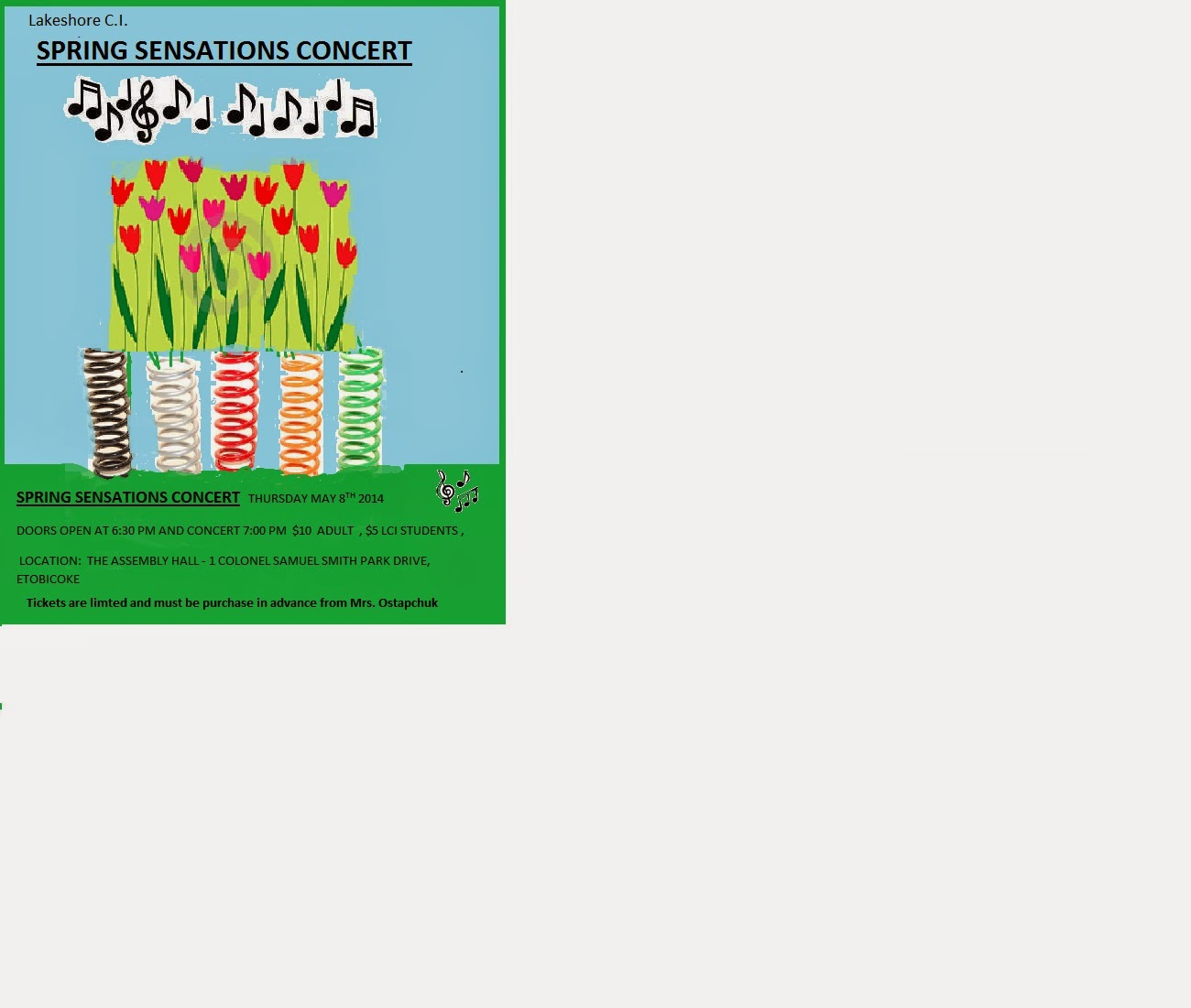
I came up with my ideas because at the time
I was just desperate on the thumbnail sketches. Rather quite suddenly an idea
pops right in there, a bouncing flower. Then I added a little irony in it
because spring the season and the bouncy piece of metal have the same name. So I
built that piece of art from scratch. Let’s
just say I thought this first poster looked good but nobody’s perfect. The
problems on the first poster were that some of the words were hard to read, I
found small to draw on, and the colour of the flowers made them almost
invisible.
Later in the month I made a brand new draft
and it looked better.
The backgrounds are light turquoise for the
sky and green for the grass. These are spring colours. I put in five spring and
some flowers to keep my original idea for the metal spring. I used black text for the poster in sky and
grass area and it looked good and stood out. I tried using white text for the
poster but it did not stand out clearly and looked ghostly.
b) Discuss your technical process.
Challenges - and how you overcame them. What steps were involved in creating
your poster?
In Adobe, I tried to add a text box and it
would freeze. Eventually I went to another computer and tried again. But the
second computer keyboard tray was loose and did not work well. Finally I got is working on another computer.
One big challenge was when I finished my
first draft, the person who was in charge of spring sensations, Ms Ostapchuk
didn’t like my poster and I was a little devastated. I still went to Comm. Tech to work in my
poster but I was a little bit gloomy.
Another challenge was getting the image of
the poster in my USB key so I could bring it home to finish it. I did not know
how to do it and the other work in Comm. Tech was overwhelming me and stressing
me out. I worked through it and created
a new version using MS Paint.
I searched the web for good images to use.
I found but could not get it is to work on the MS Paint program. The image was
hard to cut and paste and get it to match up with the colour of the background
I choose. I pasted it in the poster and
used the paint brush in MS Paint to colour in the gaps.
I also had problems with the text for the
poster. I created the text in MS Word and cut and pasted into MS Paint. Sometimes
the text box would stretch in the wrong way and I had to try again to get it
work right.
Remember that if you followed any tutorials to learn new techniques in Photoshop or Illustrator, please post the link or embed the video into your blog post and briefly explain what you learned for bonus marks! I used MS Paint program and Adobe Photo shop for the first draft.
Remember that if you followed any tutorials to learn new techniques in Photoshop or Illustrator, please post the link or embed the video into your blog post and briefly explain what you learned for bonus marks! I used MS Paint program and Adobe Photo shop for the first draft.
Thursday, 10 April 2014
Postcard
please explain which file format you chose for your postcard and why?
I chose jpeg. It was the easiest to remember. I also used the chiller font because it was a big font and could be seen in light blue color. http://www.practicalecommerce.com/articles/1821-Image-Formats-What-s-the-Difference-Between-JPG-GIF-PNG-
My procedure starts with a picture of the Parisian Disneyland haunted
mansion. The first image I picked was the
loading area where you get in the vehicles. I like the manor back story , and plus I liked the fact that one of the characters in the back story was named henry. I copied this picture off Google images. I also found a picture of a baby penguin looking ominous and immediately thought this little guy would be good in the post card since I have a liking for baby penguins. The photo after the penguin was a pair of red eyes , thanks to the mask effect the red eyes were merged into the background to become more ghostly. The last photo was me thinking a rather stupid thought at the time because I may have added a photo of Selena Gomez and now that I look at It that was a bad idea.
I selected those pictures because at that time I was fascinated by the Parisian Disney haunted mansion and my thoughts were revolving around that idea like a globe. The chiller font was the only font large enough to see and was supposed to be modeled in a tough kind of ghost like image of Mr. T. I was trying to tell an imaginative story and a spoof on the Disney mansion back story.
Step by Step
Took all my images and merged them on the screen. I Created a mask on adobe photoshop. I used it on several images and then the piece was done and it was time to add the text. I experimented with different fonts. I noticed all of the fonts looked too small. I picked a big font that would look good in caps lock. I picked a colour --blue and then typed in the message. I saved it after that.
Subscribe to:
Posts (Atom)