Thursday, 12 June 2014

Photo Essay - the Real One - Visit to Barber


This is me pre-haircut. The hair was getting almost Rapunzel like. 


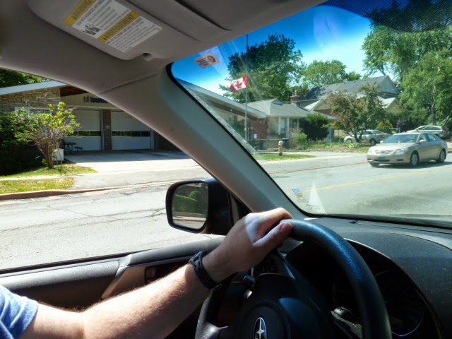
Dad is driving. Better keep his eyes on the road. Oh look there’s the fire station.
 
 Vincenzo’s Barber shop, the best quality barbershop for myself in all of
Bloor West Village.


 This is the barber shop's pole. Oddly enough I never see it spinning.


Vincenzo’s business hours.


This is the interior of the barber shop. Although small,
he is good at making magic in this place.


One of the barbershop chairs.  Old fashioned isn’t it. 
But old fashioned means good.  


Cash register at Vincenzo’s.


 $20 is the cost for a haircut at Vincenzo’s.

 
Me .  Post haircut. Handsome aren’t I.

 
The foods at the nearby Coffee Culture.  Good quality muffins.
A daily routine on a Saturday barber shop visit. is to get some food at the end .
 

Sunday, 11 May 2014

photo essay


                                  This picture has a view from over head , It has proportion because of the big and small shoes.  There is also railing lines pointing to the shoes .


This picture is an example of a light and shadow. The dark parts of the tree and houses contrast with the setting sunset sky.


This is an example of pattern and texture of a tree bark. This maple tree is at the front of my house and it perches like a flag on the front lawn.


This picture is an example of contrast. The grass is all green but the dandelion stands out in a crowd. The dandelion is eye catching.


This picture is a Grand perspective piece.  It is an example of line where the wall runs towards the ball.    this is also an example of light and shadow. the light reflects off the brick.
 
This  is a close up photo of my right eye . This is a self portrait. It is an example of close up or zoom in. what can I say  I have an eye for detail . 


 Now this one is a humour shot.   It is a bird feeder  with a naughty  Squirrel  on it.  There is a frame around the bird feeder created by the tree branches .  There is also texture from the tree trunk and branches .


Wednesday, 7 May 2014

camerons mighty composition


Ideas for Cameron's mighty composition essay

Art Class

·         People making gargoyles or just slacking off 

·         Paintings being done or getting started

·         Kiln for pottery when its ready

·         Teachers talking about the lesson

·         Windows letting in grand sunlight

·         Good perspective in the pottery room ( a magnificent view of the windows casting sunlight)

·         The paint bits that you peel off 

·         The colour that the water changes to when you get rid of waste paint.

Rose’s room 115 at lunch

·         Computers

·         Rose on her computer playing some word game

·         Adam and Hasuh talking

·         Table where people sit and talk about what’s new

·         Crevice where you can see the library through the window

·         Photos on the walls of roses students (and also myself)

·         The random spiked ornament hanging ominously on the ceiling  

·         3 Paper cranes dangling on the ceiling like a popcorn string

Taking TTC to school

Royal York Subway station billboards, escalator, people, guys working on the escalator, Gateway newsstand, walls and lights, subway car and platform, inside of the subway car

On the way – the signal lights, people on the subway, ads on the subway,  Kipling area from subway car view ,   newsstand  rear end ,  44 platform ,  44 bus route , 

On the bus  777 Kipling avenue ,  Kipling yards,  a factory which may deliver by train ,  and the MasterCard centre ,   the water tower,   the way towards humber college,  the bus stop at Birmingham   

Cafeteria at LCI

·          The vending machine in the cafeteria  

·         The spot in the cafeteria where they serve hamburgers

·         The spot in the cafeteria where the  today’s special is waiting

·         The table which is in front of the vending machine  providing a crystal clear view of the assorted drinks in the prized machine

·         Cheese burger (before I eat it )

·         Today’s  special being served     

Sunday, 27 April 2014

camera research final


April 18, 2014

Five Cameras Research by Cameron Smith

Different brands

SLR film camera – (Single lens reflector)

Brands: Canon, Minolta, Nikon

Good for: The manual controls can give you flexibility in how to take photos. People also like it old fashioned (non digital). It has good image quality on printed pictures. You can take alot of different types of pictures using lens, lights and tri-pods.

Drawbacks: The problems are you need to develop film in processing. It is non digital so it’s hard to develop films, it costs money to buy film, film is hard to find at stores and this type of camera rarely available so it is hard to buy these brands or to fix one.  It is also harder to learn how to use this camera.

Medium Format

Brands Holga, Mamiya, Fuji, Pentax

Good for:  It is good for getting close up photos with manual lens. It is not as heavy so  you can carry it around easier, good for taking pictures of larger areas like landscapes or cars or houses, can be used for focusing in a large picture of something small with a lot details.

Drawbacks: They can be really expensive ($10,000). They are not adaptable as they take specialty pictures. Many of these types of cameras use film not digital so they are hard to use., not very flexible for taking a variety of pictures and seem hard to figure out how to use.

Large format

Brands: Kodak, Monorail, Arc Swiss

Good for: These cameras take larger then medium format  photos so you get better picture quality and can take really large photos of landscapes and lakes. You can get film or digital versions of large format cameras.

Drawbacks: This camera is really heavy to hold so it you will tired lugging it around. If it breaks it could be expensive to fix. Sometimes you need to develop your own film and that it not easy – even for printing digital pictures. This type of camera is not very flexible, could be hard to figure out how to use and good for large but not small or regular old picture taking.

Digital SLR

Brands: Sigma, Canon, Tamron, Tokina, Panasonic

Good for:    This camera is good photo shooting and it has zoom in or out options for picture taking. You can download your photos to a memory card or computer. It is easier to use and lots of different types of digital cameras to choose from. It can take some speciality pictures using special equipment like lights and lots of lenses.  

Drawbacks: They can be very advanced and you need to know how to use the manual options for using the camera, they are more expensive than some cameras and sometimes they are little bigger and heavier to carry around.

Point and shoot

Brands: Canon, Yashica Panasonic

Good for: This type of camera is good for group shots, versatile for most types of picture taking, general small, light, easy to use and carry around. It automatically sets up to take a picture – you do not need to set the controls. You can have a digital version or a film version but the digital version is more common.

Drawbacks: Although you can take alot of pictures, it has a limited number of views to take pictures and cannot choose to take pictures in a different way. You cannot take speciality pictures except what is offered in automatic option, you are limited in how far you can zoom on a point and shoot and you are limited in using other equipment like extra lights.  

Which camera is good for you?

The camera that is good for me is the  point n shoot because it’s the only modern camera that I could recognise easily  and the only hand held one so that my hands wouldn’t get tired using it . The camera doesn’t cost a lot of money to buy, it’s flexible and can take a lot of different pictures. It’s easier to use then the other cameras.  I also like the fact that you can put the photos on the computer with no sweat. To add more good news, there’s no film to buy or develop so no hassle whatsoever.

magnifique elements of design


elements and principlez of design


spring sensations tickets


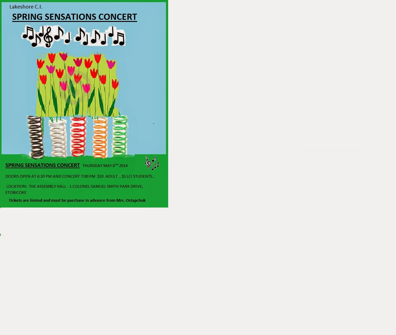
SPRING SENSATIONS CONCERT   http://www.wflc.net/images/MyStuff/musicnotes.gifTHURSDAY MAY 8TH 2014
DOORS OPEN AT 6:30 PM AND CONCERT 7:00 PM  $10  ADULT  , $5 LCI STUDENTS ,
 LOCATION:  THE ASSEMBLY HALL - 1 COLONEL SAMUEL SMITH PARK DRIVE,  ETOBICOKE       
SPRING SENSATIONS CONCERT   http://www.wflc.net/images/MyStuff/musicnotes.gifTHURSDAY MAY 8TH 2014
DOORS OPEN AT 6:30 PM AND CONCERT 7:00 PM  $10  ADULT  , $5 LCI STUDENTS ,
 LOCATION:  THE ASSEMBLY HALL - 1 COLONEL SAMUEL SMITH PARK DRIVE,  ETOBICOKE       
SPRING SENSATIONS CONCERT   http://www.wflc.net/images/MyStuff/musicnotes.gifTHURSDAY MAY 8TH 2014
DOORS OPEN AT 6:30 PM AND CONCERT 7:00 PM  $10  ADULT  , $5 LCI STUDENTS ,
 LOCATION:  THE ASSEMBLY HALL - 1 COLONEL SAMUEL SMITH PARK DRIVE,  ETOBICOKE       
SPRING SENSATIONS CONCERT   http://www.wflc.net/images/MyStuff/musicnotes.gifTHURSDAY MAY 8TH 2014
DOORS OPEN AT 6:30 PM AND CONCERT 7:00 PM  $10  ADULT  , $5 LCI STUDENTS ,
 LOCATION:  THE ASSEMBLY HALL - 1 COLONEL SAMUEL SMITH PARK DRIVE,  ETOBICOKE       
SPRING SENSATIONS CONCERT   http://www.wflc.net/images/MyStuff/musicnotes.gifTHURSDAY MAY 8TH 2014
DOORS OPEN AT 6:30 PM AND CONCERT 7:00 PM  $10  ADULT  , $5 LCI STUDENTS ,
 LOCATION:  THE ASSEMBLY HALL - 1 COLONEL SAMUEL SMITH PARK DRIVE,  ETOBICOKE       
SPRING SENSATIONS CONCERT   http://www.wflc.net/images/MyStuff/musicnotes.gifTHURSDAY MAY 8TH 2014
DOORS OPEN AT 6:30 PM AND CONCERT 7:00 PM  $10  ADULT  , $5 LCI STUDENTS ,
 LOCATION:  THE ASSEMBLY HALL - 1 COLONEL SAMUEL SMITH PARK DRIVE,  ETOBICOKE        
SPRING SENSATIONS CONCERT   http://www.wflc.net/images/MyStuff/musicnotes.gifTHURSDAY MAY 8TH 2014
DOORS OPEN AT 6:30 PM AND CONCERT 7:00 PM  $10  ADULT  , $5 LCI STUDENTS ,
 LOCATION:  THE ASSEMBLY HALL - 1 COLONEL SAMUEL SMITH PARK DRIVE,  ETOBICOKE       
SPRING SENSATIONS CONCERT   http://www.wflc.net/images/MyStuff/musicnotes.gifTHURSDAY MAY 8TH 2014
DOORS OPEN AT 6:30 PM AND CONCERT 7:00 PM  $10  ADULT  , $5 LCI STUDENTS ,
 LOCATION:  THE ASSEMBLY HALL - 1 COLONEL SAMUEL SMITH PARK DRIVE,  ETOBICOKE       


thumbnails idea


spring sensation writeup


Prepared by Cameron Smith

a) Discuss your creative process. How did you come up with your ideas for visuals/visual meaning/colours/fonts etc?

I came up with my ideas because at the time I was just desperate on the thumbnail sketches. Rather quite suddenly an idea pops right in there, a bouncing flower. Then I added a little irony in it because spring the season and the bouncy piece of metal have the same name. So I built that piece of art from scratch.  Let’s just say I thought this first poster looked good but nobody’s perfect. The problems on the first poster were that some of the words were hard to read, I found small to draw on, and the colour of the flowers made them almost invisible.

Later in the month I made a brand new draft and it looked better.   

The backgrounds are light turquoise for the sky and green for the grass. These are spring colours. I put in five spring and some flowers to keep my original idea for the metal spring.  I used black text for the poster in sky and grass area and it looked good and stood out. I tried using white text for the poster but it did not stand out clearly and looked ghostly. 

b) Discuss your technical process. Challenges - and how you overcame them. What steps were involved in creating your poster?

In Adobe, I tried to add a text box and it would freeze. Eventually I went to another computer and tried again. But the second computer keyboard tray was loose and did not work well.  Finally I got is working on another computer.

One big challenge was when I finished my first draft, the person who was in charge of spring sensations, Ms Ostapchuk didn’t like my poster and I was a little devastated.  I still went to Comm. Tech to work in my poster but I was a little bit gloomy.

Another challenge was getting the image of the poster in my USB key so I could bring it home to finish it. I did not know how to do it and the other work in Comm. Tech was overwhelming me and stressing me out.  I worked through it and created a new version using MS Paint.  

I searched the web for good images to use. I found but could not get it is to work on the MS Paint program. The image was hard to cut and paste and get it to match up with the colour of the background I choose.  I pasted it in the poster and used the paint brush in MS Paint to colour in the gaps.

I also had problems with the text for the poster. I created the text in MS Word and cut and pasted into MS Paint. Sometimes the text box would stretch in the wrong way and I had to try again to get it work right.
Remember that if you followed any tutorials to learn new techniques in Photoshop or Illustrator, please post the link or embed the video into your blog post and briefly explain what you learned for bonus marks!  I used MS Paint program and Adobe Photo shop for the first draft.

spring sensations poster (about time )


Thursday, 10 April 2014

Postcard


please explain which file format you chose for your postcard and why?
I chose jpeg.  It was the easiest to remember.  I also used the chiller font because it was a big font and could be seen in light blue color. http://www.practicalecommerce.com/articles/1821-Image-Formats-What-s-the-Difference-Between-JPG-GIF-PNG-
 
My procedure starts with a picture of the Parisian Disneyland haunted mansion. The first image I picked was the loading area where you get in the  vehicles.  I like the manor back story , and plus I liked the fact that one of the characters in the back story was named henry.  I copied this picture off Google images.   I also found a picture of a baby penguin looking ominous and immediately thought this little guy would be good in the post card since I have a liking for baby penguins.  The  photo after the penguin  was a pair of red eyes ,  thanks to the mask effect  the red eyes were merged into the background  to become more ghostly.  The last photo was me thinking a rather stupid thought  at the time  because I may have added a photo of Selena Gomez and now that I look at It  that was a bad idea. 
 
I selected those pictures because at that time I was fascinated by the Parisian Disney haunted mansion and my thoughts were revolving around that idea like a globe.  The chiller font was the only font large enough  to see  and was supposed to be modeled in a  tough kind of ghost like image of Mr. T.  I was trying to tell an imaginative story and a spoof on the Disney mansion back story. 
Step by Step
Took all my images and merged them on the screen. I Created a mask on adobe photoshop. I used it on several images and then the piece was done and it was time to add the text.  I experimented with different fonts.  I noticed all of the fonts looked too small.  I picked a big font that would look good in caps lock.  I picked a colour --blue and then typed in the message.  I saved it after that.
 

Tuesday, 25 February 2014

Exclusive: Olly Moss Reimagines Star Wars Original Trilogy for Mondo | Underwire | Wired.com

This poster is quite the cool color. The color is a misty light blue green. I like this poster because it is looks like a window looking out to Endor  a forest planet in the star wars universe.   If you have seen return of the Jedi  then you'll know what I mean. The typing in it is a grand way to type.  The title can be seen from miles away. Frequently the Star Wars title at the beginning of every movie is hard to write down on a sheet of paper because the way its drawn is so complicated it would make a supercomputer explode.   The way the title is presented is a unique because it is drawn in a advanced way because the letters seem almost fused together.